Data Visualization
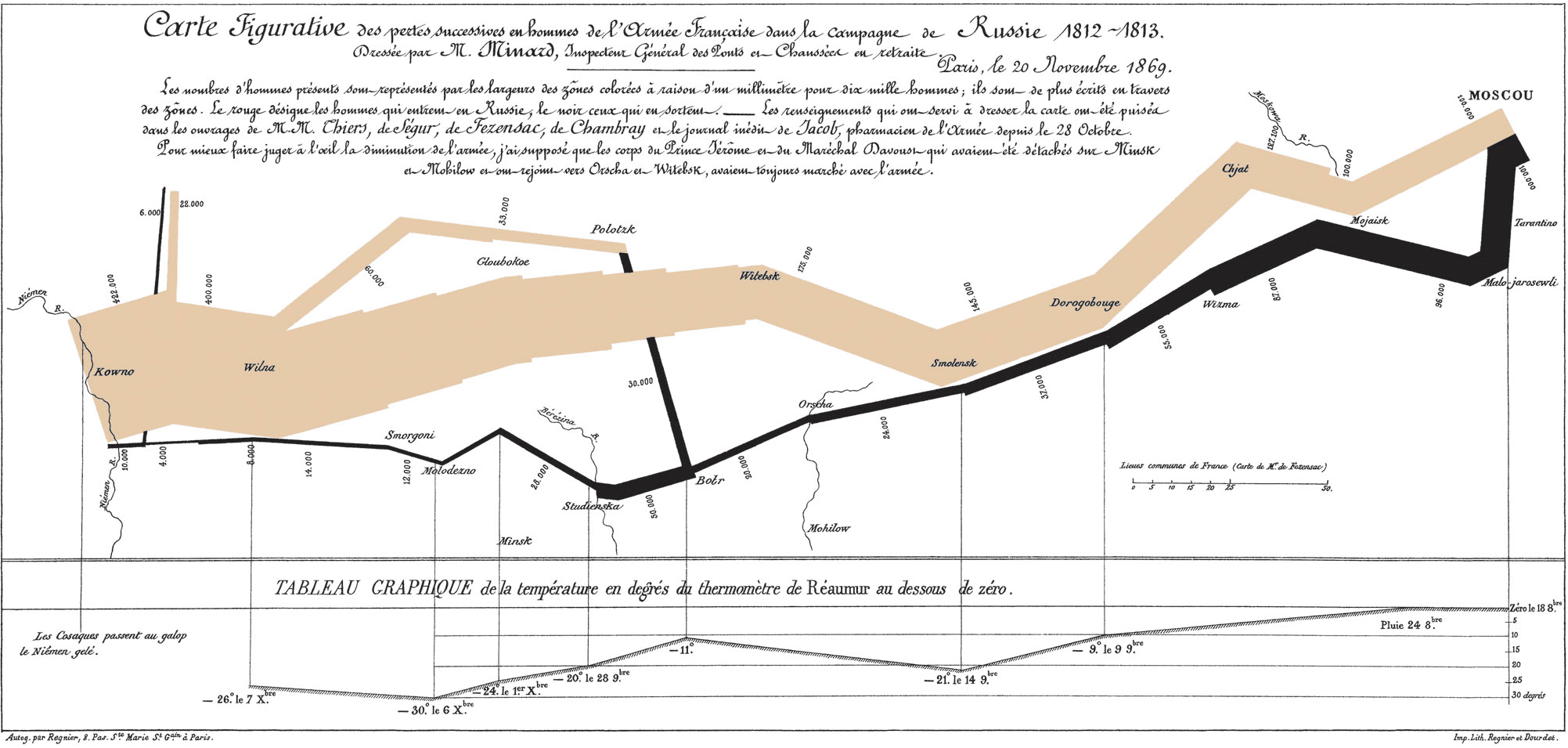
Data and information visualization is the practice of designing and creating graphic or visual representations of quantitative and qualitative data and information with the help of static, dynamic or interactive visual items. These visualizations are intended to help a target audience visually explore and discover, quickly understand, interpret and gain important insights into otherwise difficult-to-identify structures, relationships, correlations, local and global patterns, trends, variations, constancy, clusters, outliers and unusual groupings within data. When intended for the public to convey a concise version of information in an engaging manner, it is typically called infographics.
- Collatz Conjecture in Color - Numberphile
- What If Light Was Really Slow?
- Plotting Pi and Searching for Mona Lisa - Numberphile
- EntiTree
- Our World in Data
- Research and data to make progress against the world’s largest problems
- When Graphs Are a Matter of Life and Death
- A Better Way To Picture Atoms
- Stand-up comedy routine about Spreadsheets
- Oily House Index
- Map tracks Antarctica on the move
- Histomap: Visualizing the 4,000 Year History of Global Power
- 2010 gears up for explosion of 3D
- Data visualization
ENGLISH COLLECTIONNOVEMBER 3, 2025 AT 03:32:40 UTC